Apple Redesign
About the project
As for the project, I was faced with the need to randomly choose a company, without knowing the task that awaited us. The challenge turned out to be significant when I discovered that the selected company was Apple.
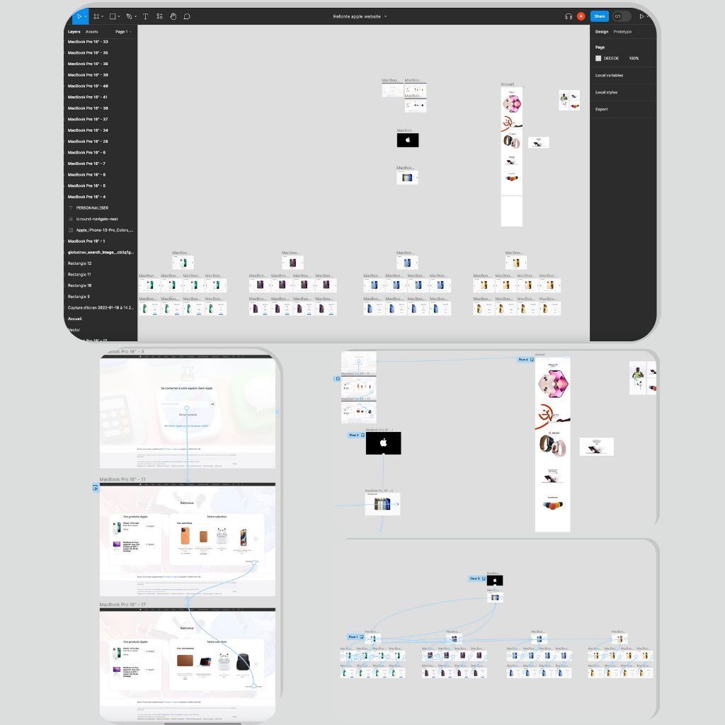
To be honest, I had no idea what to expect. So, the project involved identifying any « issues » users might encounter on the brand’s website and proposing suitable solutions. My proposal focused on the customer area. As a fervent admirer of Apple, I am well aware of my attachment to the brand. However, I find that the support and user sections lack detail and are not as intuitive as they could be.
Creating something so complex in just 24 hours was a daunting challenge. While our proposal may seem simple at first glance, the reality of this endeavor was much more demanding, ultimately earning our project a perfect score of 20/20!
This project was a true passion for me, as it touched on a field and company that deeply interested me. Furthermore, it addressed a concrete issue I had encountered before, which strengthened my commitment to seeing it through.
During these three months, I had the chance to work on a topic that interested me, using a software I know and master, namely WordPress and its various extensions.

